AggieRewards
PRODUCT DESIGN & RESEARCH
INTRODUCTION
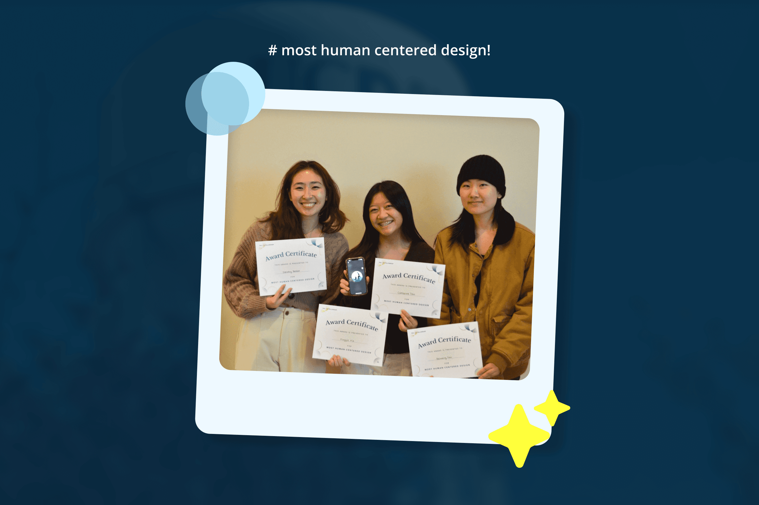
During a design sprint organized by a campus club, I along with 3 fellow designers developed an app called Aggie Rewards to incentivize students to dine on campus. The project aimed to address the decline in on-campus dining by providing a rewards-based incentive. Our design won the "Most Human-Centered Design" award.
MY ROLE
Together with my team, we split roles within researching recurring problems within on-campus dining, conducting out user interviews, analyzing collected data, and brainstorming innovative solutions to enhance the dining experience on campus.
Individually, in the design realm, I conceptualized different various layouts for the rewards page through exploring different design components, expanding user flows, and ensuring the experience was a blend of interactive and captivating
OVERVIEW
AggieRewards is designed as a mobile app accessed by UC Davis students and faculty to encourage more on-campus dining through an interactive rewards program.
The initial concept for AggieRewards was developed during a six-week design sprint hosted by Design Interactive at UC Davis. The prompt was to create a digital platform that rewards students for visiting their favorite on-campus spots. Our team of four designers, including myself, aimed to motivate students to choose on-campus dining over off-campus options. Once the event had closed, my team was awarded with the Most Human-Centered Design.
PROBLEM
Food is HORRIBLY Expensive
SOLUTION
Rewards = Free = Motivation to Buy More Food
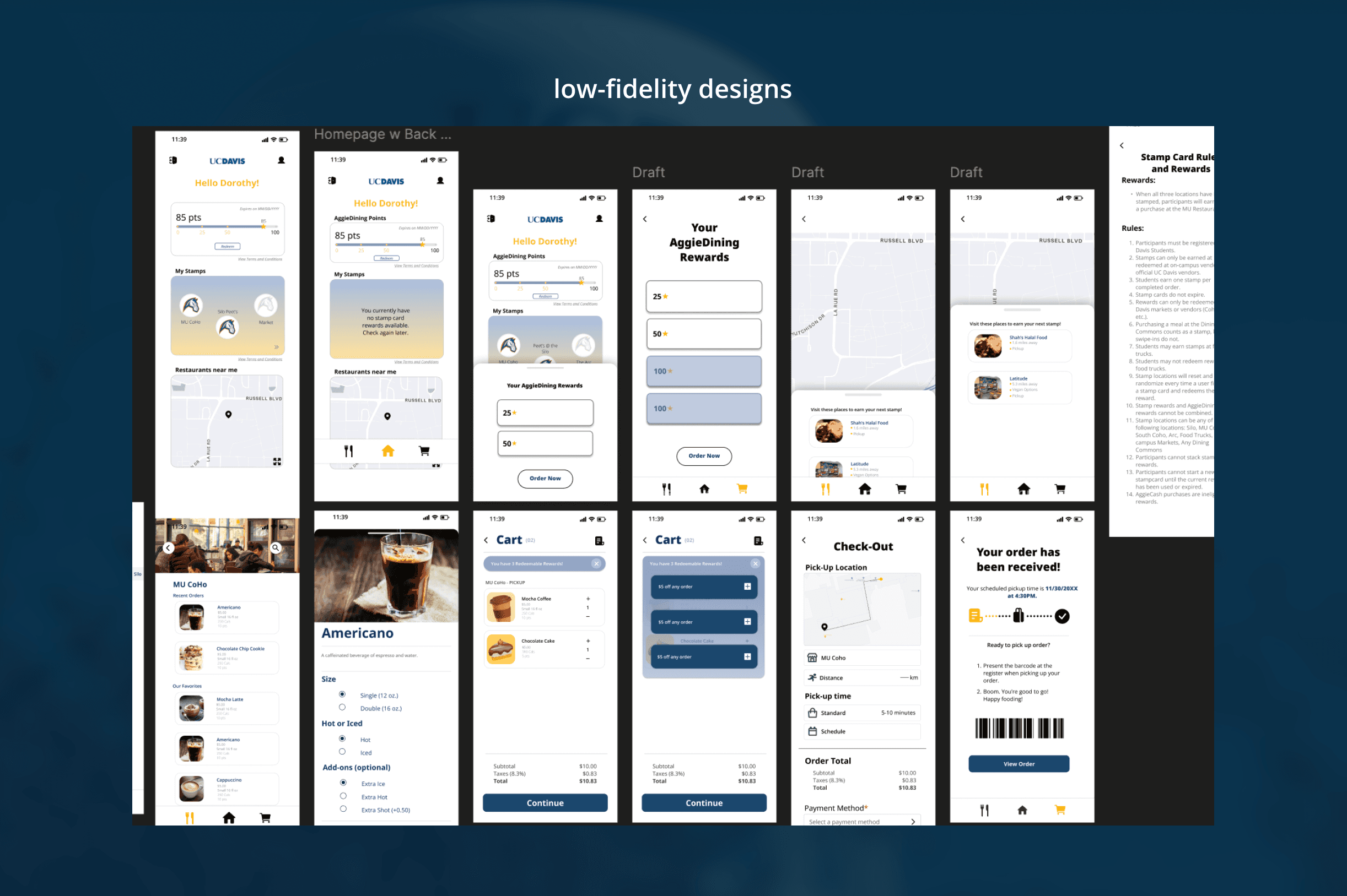
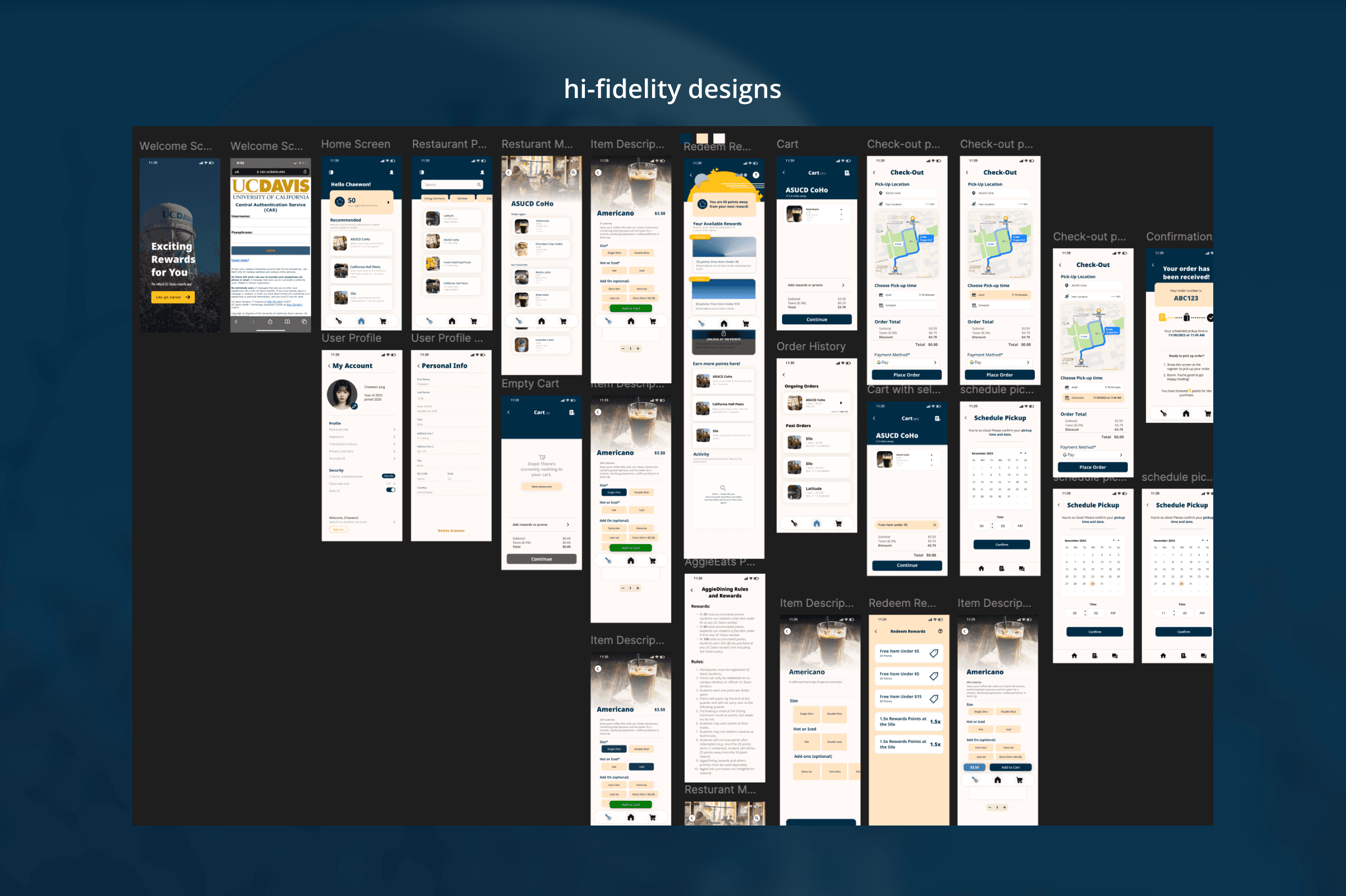
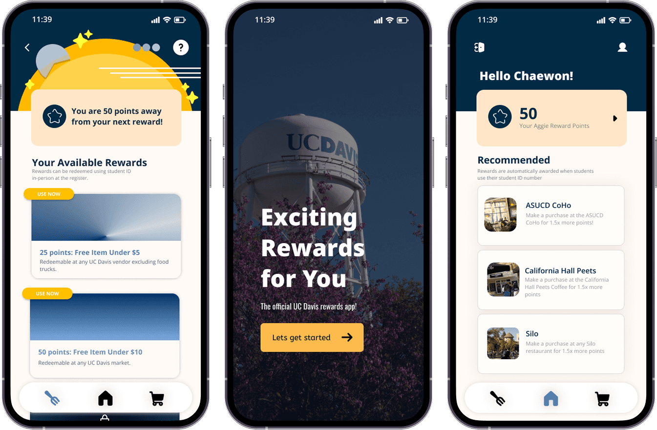
In order to have UC Davis students dine more frequently on campus, we developed a durable and accessible rewards program. Initially, my team considered a stamp card system, which later evolved into a points-based rewards program. We created a platform where students can view their accumulated points, schedule orders for meals and drinks, and see the distance to each eatery—all with a simple tap.
COMPETITIVE AUDIT + ANALYSIS
There is No "Easy Mode".
We noticed that most programs lacked an "easy mode" and had clunky navigation. They were either too wordy and overwhelming or visually unappealing. For example:
McDonald's app is user-friendly and offers frequent rewards but feels crowded with food items yelling at you.
Teaspoon, a local boba shop, gives you 2 points (Golden Spoons) for every dollar spent. When you reach 120 Golden Spoons ($60), you get a free drink. Not exactly a steal.
• • Sephora’s tiered loyalty program offers exclusive rewards, but you typically need to spend over $100 just to get a free face wash worth $10. Seems a bit steep, right?
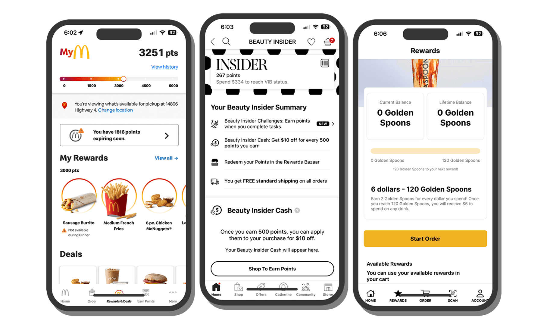
COMPETITING REWARDS SYSTEMS
USER RESEARCH
The People want CHEAP & EASY
We surveyed students and found:
53% rarely dine on campus – a lot of students aren't using campus dining.
41% would dine on campus more if there were rewards – a solid potential for a rewards-based system.
Through our research, we found that a successful rewards program needs to be:
Accessible: Easy for all students to sign up and use.
Easy to Understand: Simple rules and clear rewards.
Desirable: Offering rewards that students genuinely want and feel are worth the effort.
IDEATION
"Easy, Simple, Clean."
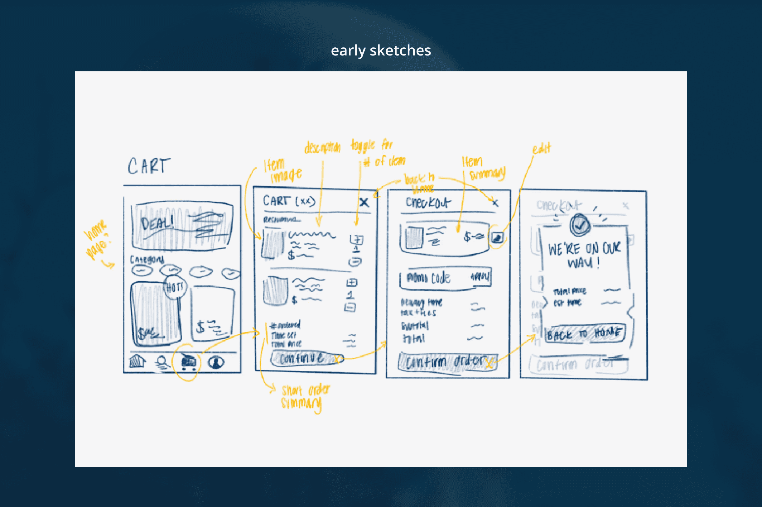
With four designers gathered around a laptop, we brainstormed ways to enhance the on-campus dining experience. We envisioned a digital stamp card that rewarded users for visiting selected spots on campus, similar to a scavenger hunt. Later, we considered a loyalty program that would reset every quarter. We tossed around multiple ideas, but none seemed to stick, as they often had issues, like how to determine the equivalency of items from different restaurants on the stamp card. Each designer was tasked to develop their own version of a rewards program, which was then put through User Testing to determine which design was most appealing to consumers.
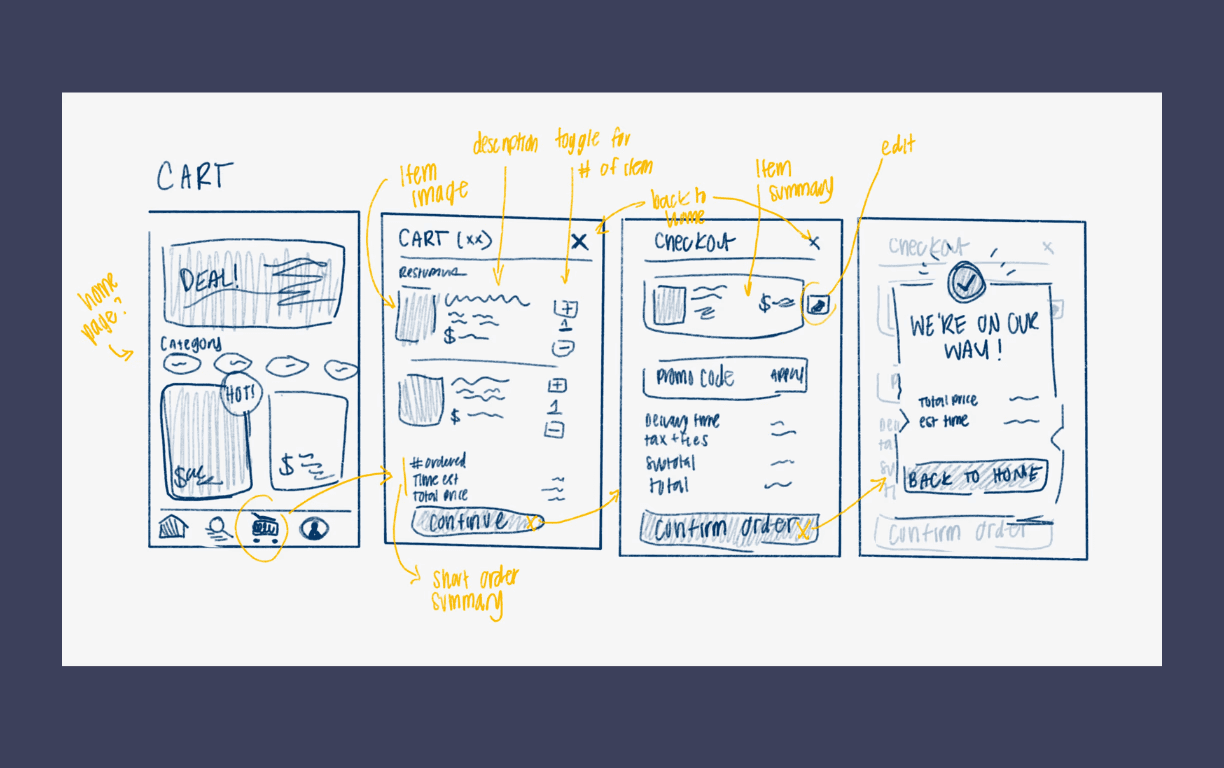
EARLY SKETCHES & USER FLOW
USER TESTING
ITERATIONS
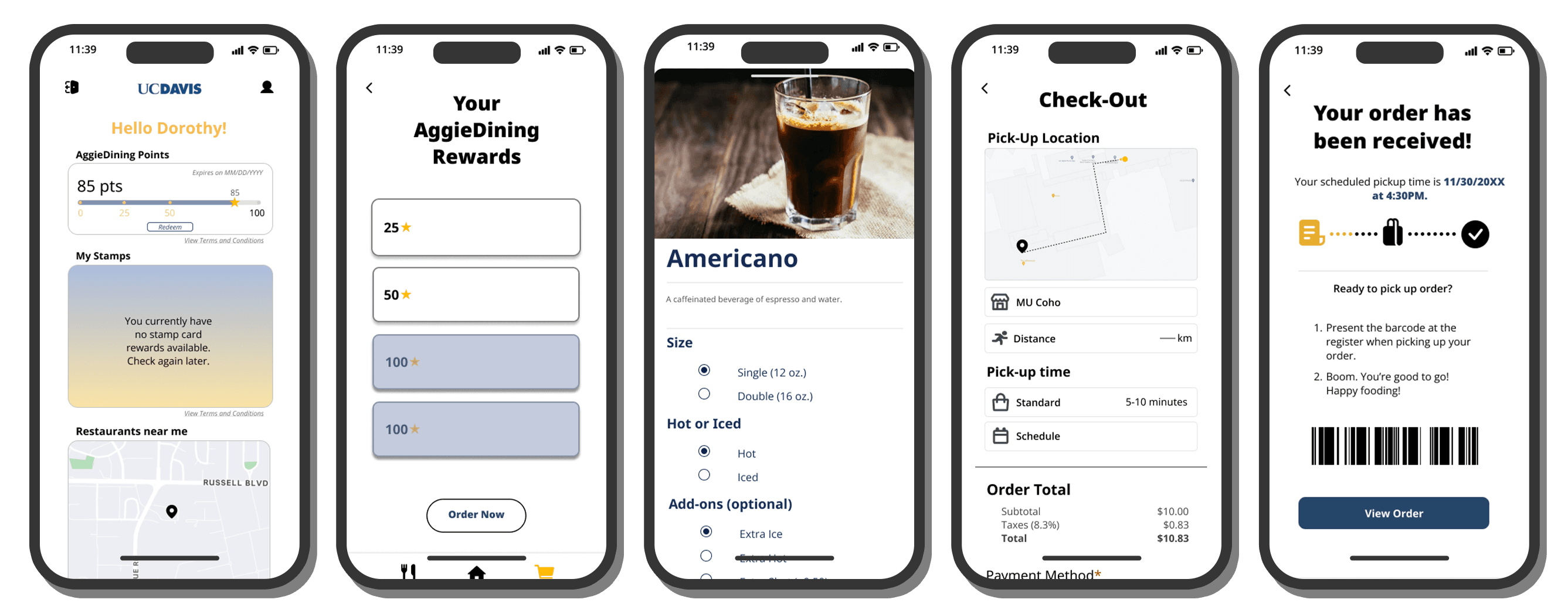
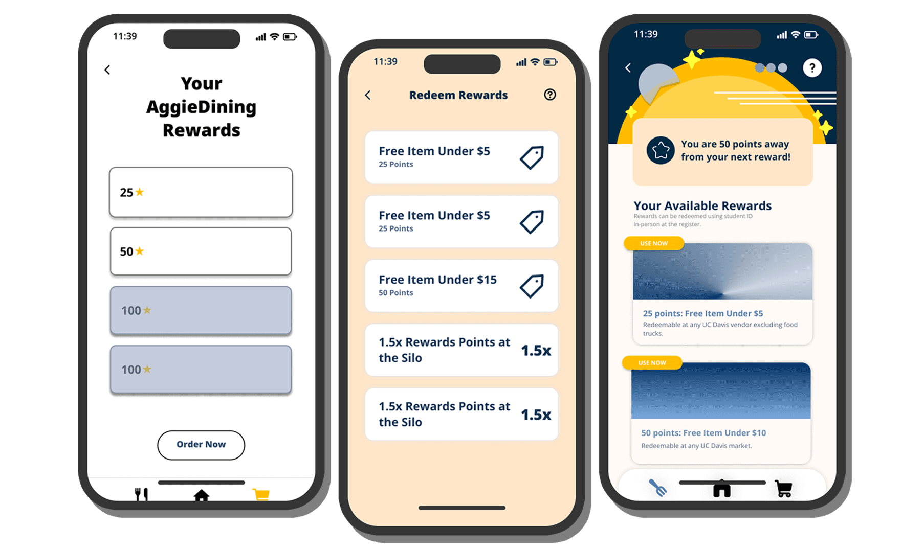
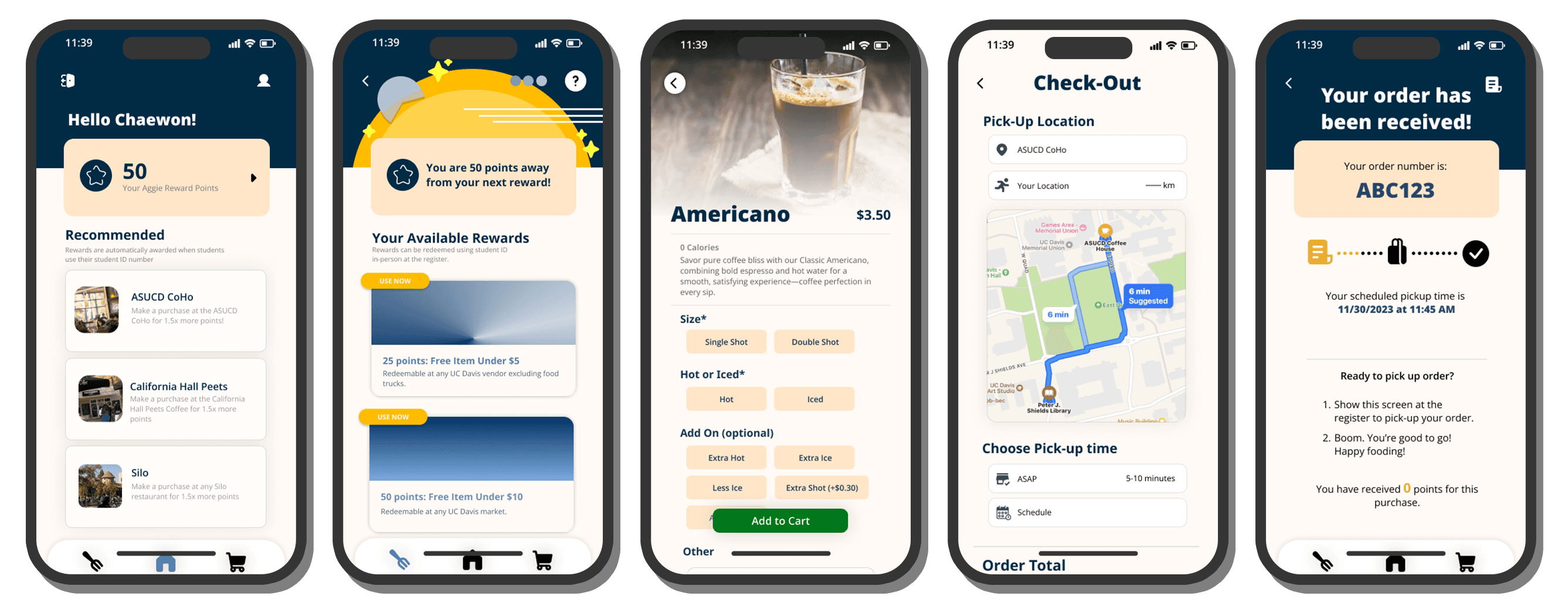
THE FINAL PRODUCT
Challenges???
ITERATIONS & DRAFTS ⤵︎